CHALLENGE
- Make a rebranding for Russian Mining and Chemical Company.
- Develop a single, cohesive umbrella brand that would consolidate seven product brands, one corporate entity, and four manufacturing companies.
ABOUT
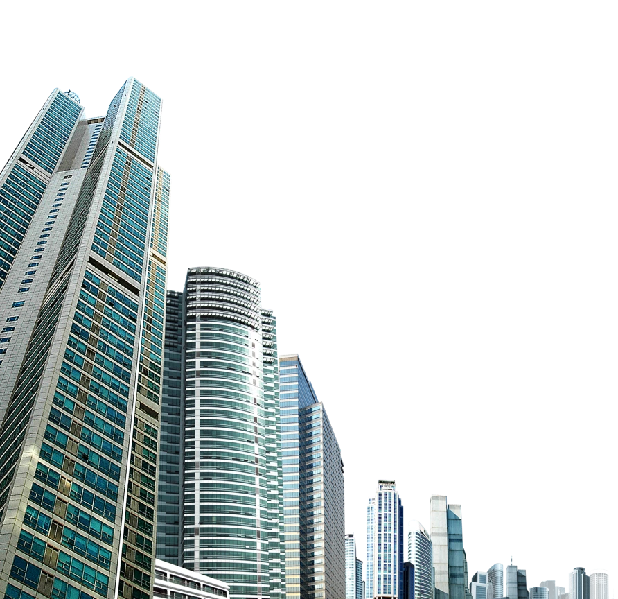
Russian Mining and Chemical Company (RMCC) is a leading player in mineral extraction, specializing in brucite mining and developing innovative applications for this versatile mineral. From metallurgy to agriculture, RMCC continues to expand its presence across Russian and global markets.
SOLUTION
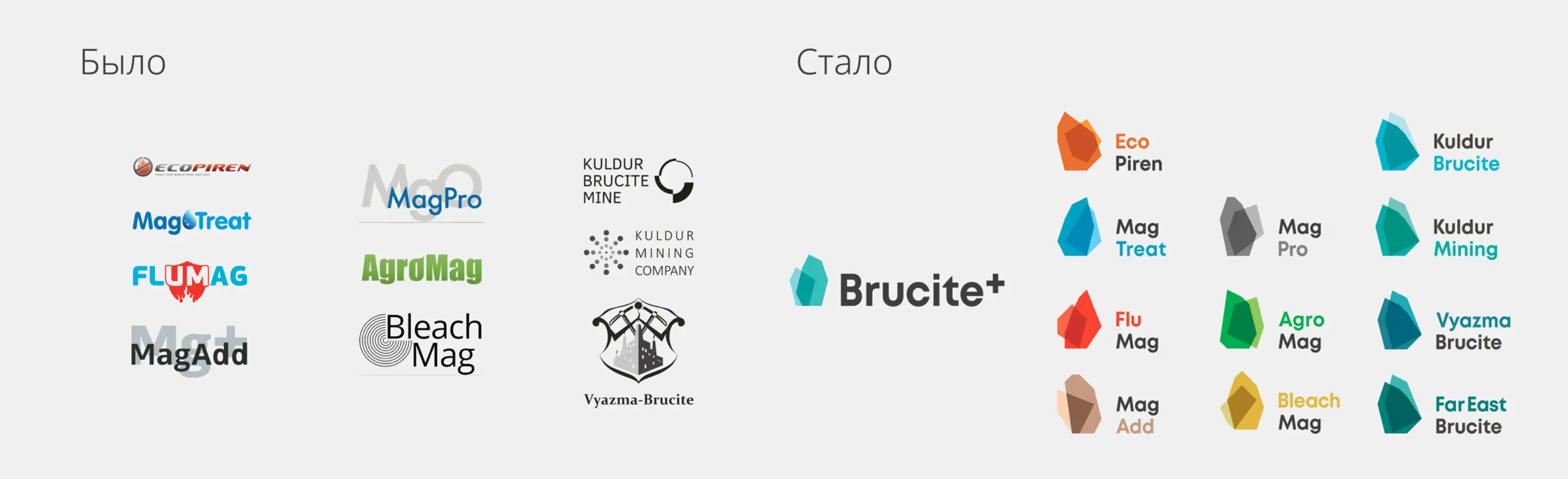
For over 15 years, RMCC created separate brands for each new market entry. However, managing a diverse portfolio of 12 standalone brands became inefficient and diluted the company’s positioning.
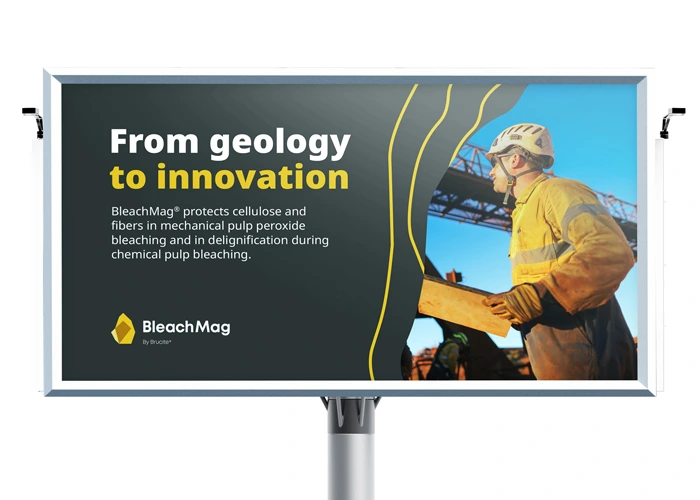
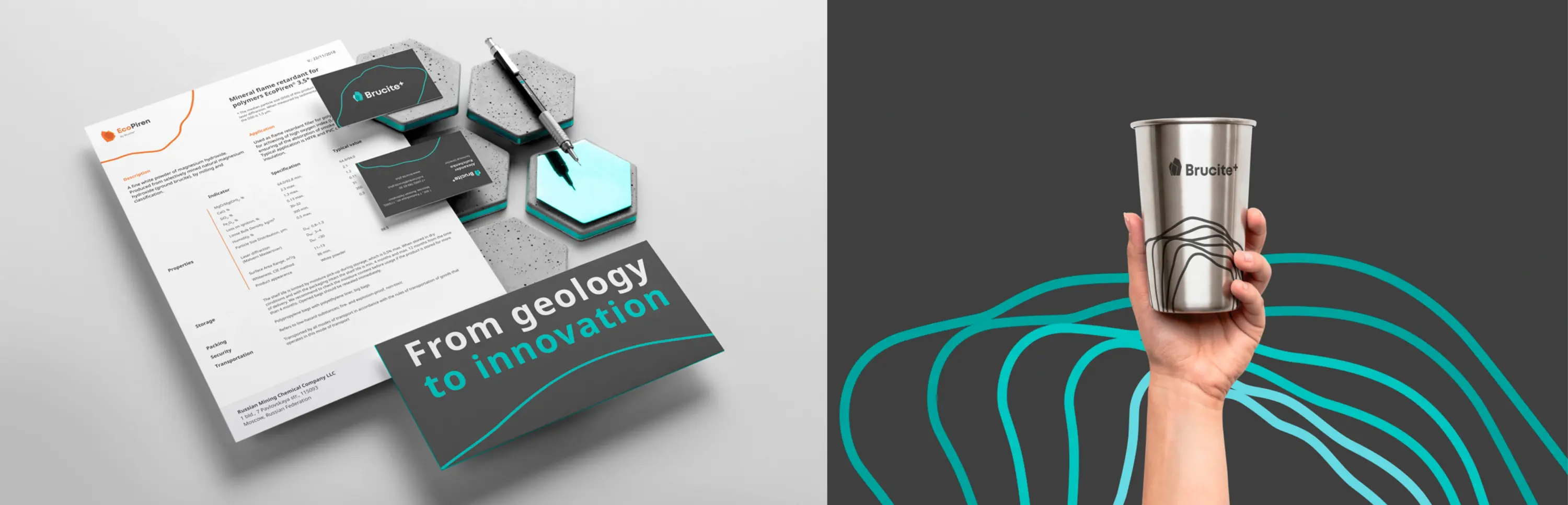
Instead of seven separate product brands, one corporate entity, and four manufacturing companies we developed a single umbrella brand with a dynamic, polymorphic identity. The solution brought together all 12 RMCC brands under a cohesive visual and strategic framework.
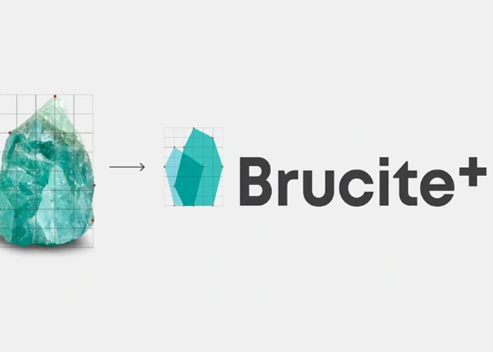
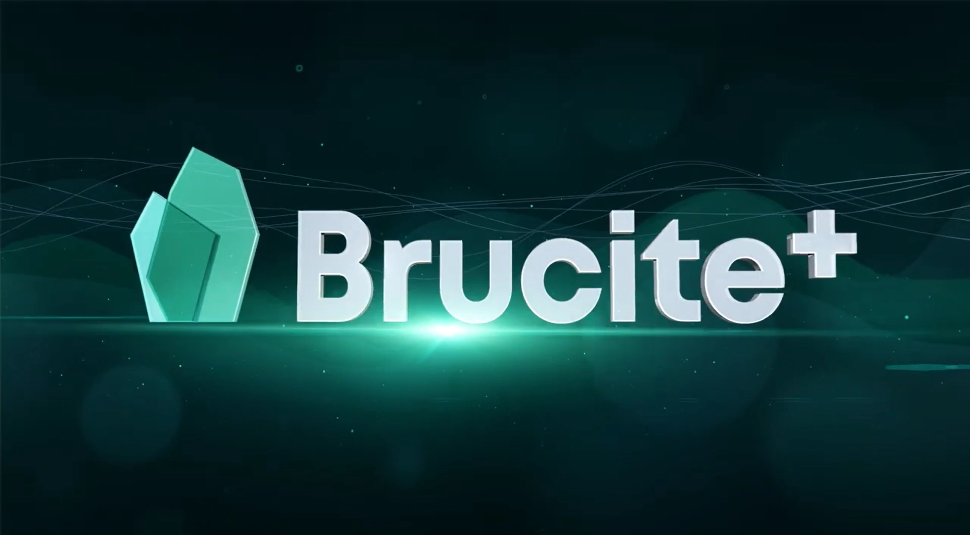
The branding concept was built around the brucite mineral and geodetic lines, reinforcing the company’s core expertise. The new name, Brucite+, firmly established the brand within its category on the global stage.
Since brucite is not widely known as a mineral, we integrated its image into the logo, transforming it into an explanatory visual element.
REBRANDING
KEY CAMPAIGN MOMENTS
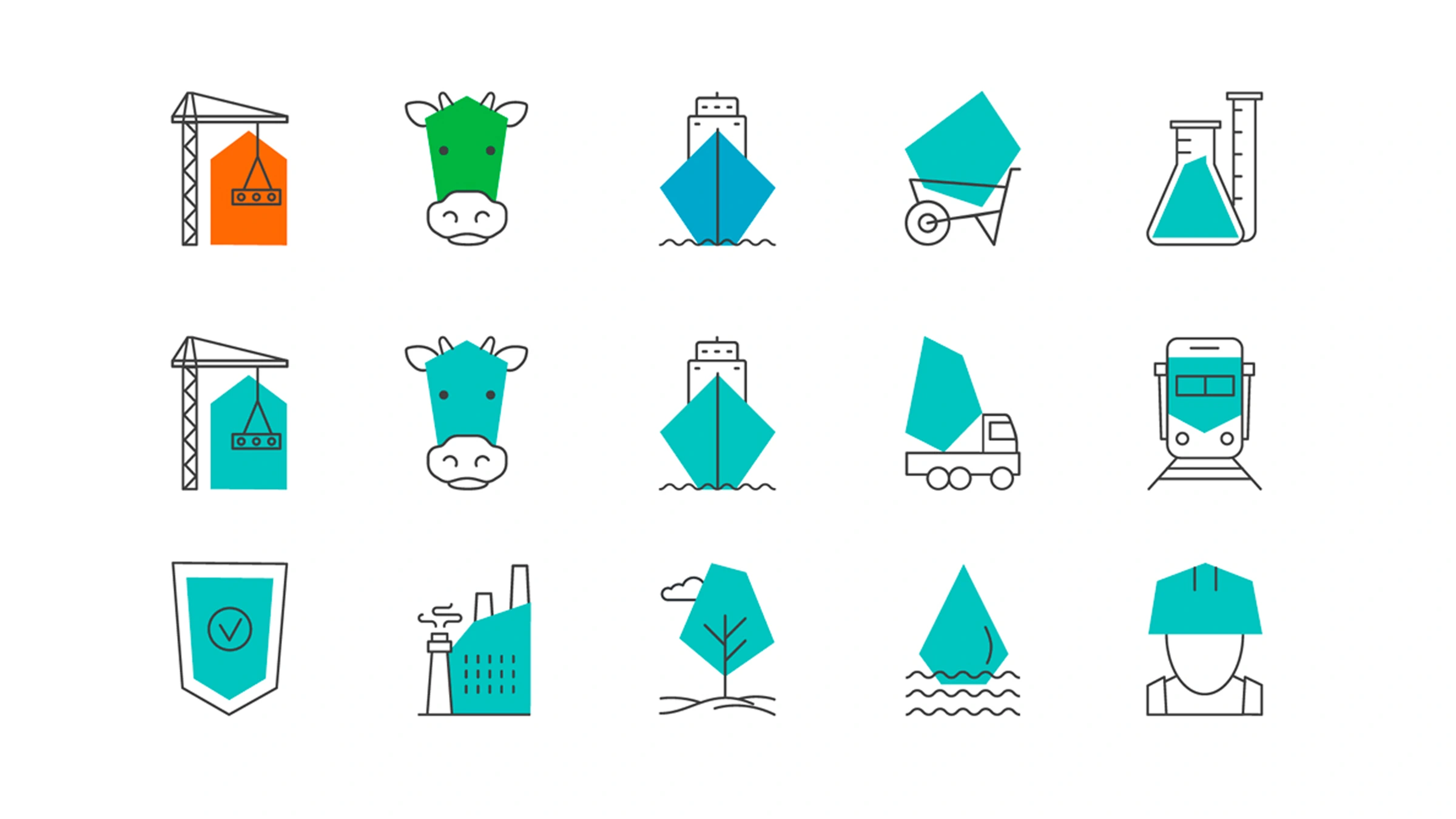
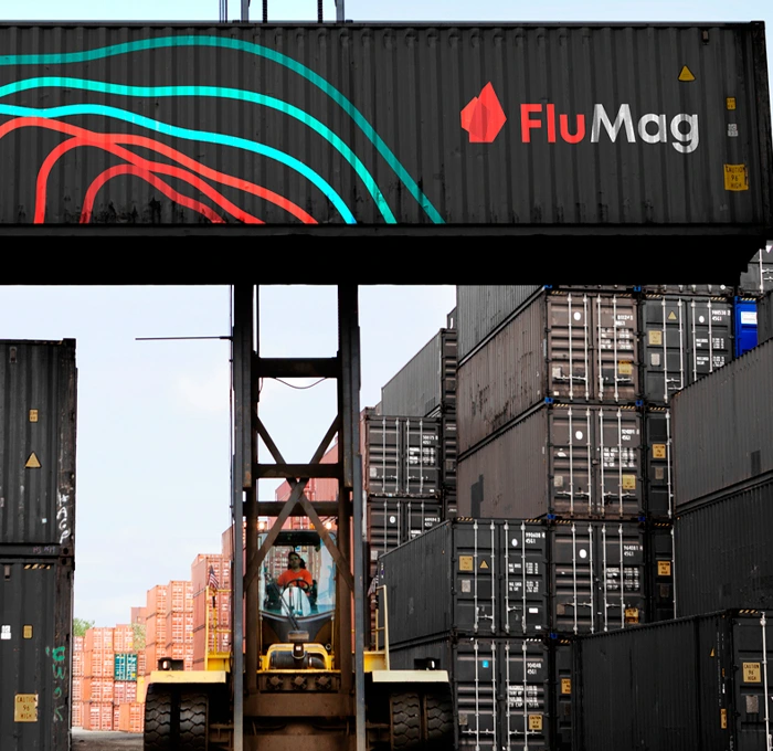
A key component of our approach was the creation of a flexible algorithm that allows for the generation of a virtually infinite number of logo variations. Each version retains a unique form while remaining part of the overarching Brucite+ identity system.

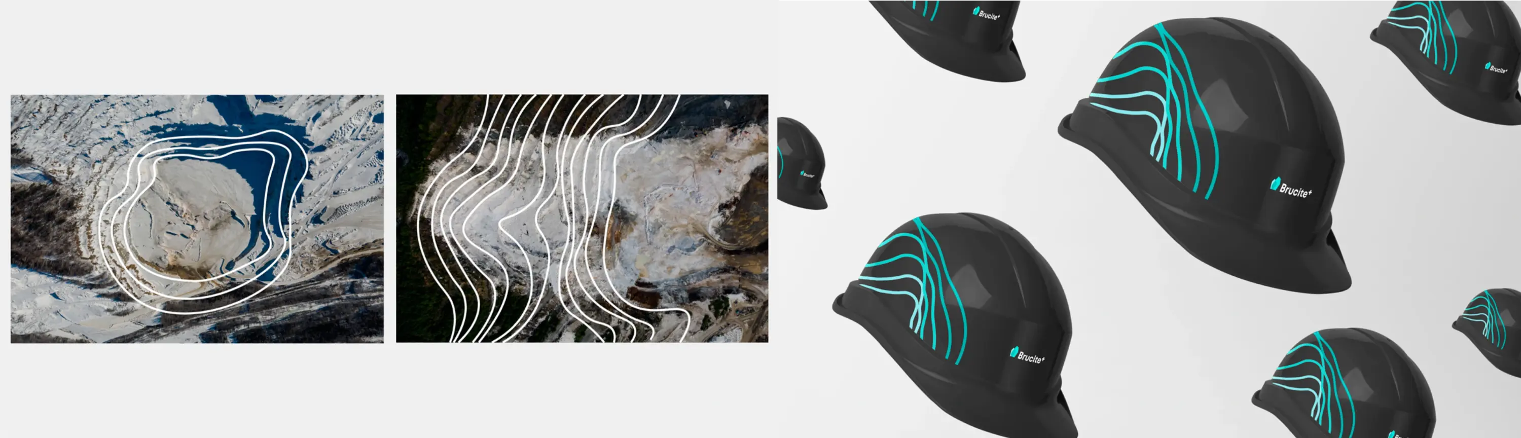
STYLE
The visual identity is rooted in simplified geodetic lines, commonly found in geological maps. This stylistic approach reinforces RMCC’s connection to mineral exploration and resource extraction.
RESULT
The rebranding successfully merged 12 separate brands into a unified Brucite+ identity, strengthening brand synergy across local and international markets. RMCC retained its name as the parent company, but it was phased out of external communications.
By consolidating seven product brands, one corporate entity, and four manufacturing companies under a single, dynamic identity, RMCC established a powerful, cohesive presence. The solution brought together all 12 RMCC brands under a cohesive visual and strategic framework.
The branding concept was built around the brucite mineral and geodetic lines, reinforcing the company’s core expertise. The new name, Brucite+, firmly established the brand within its category on the global stage.
RELATED PROJECTS